Victoria’s Secret Rewards: Tiered loyalty redesign
The Challenge
Victoria’s Secret’s legacy rewards structure was fragmented, making it difficult for users to understand their benefits or progress through the loyalty pipeline. The initiative required auditing their existing offerings, restructuring complex rewards mechanisms, and translating those concepts into an intuitive visual system.
The Solution & Strategy
We consolidated their existing reward touchpoints into a unified, three-tiered loyalty architecture designed to incentivize long-term engagement. Through strategic UI/UX design, visual storytelling, and tailored brand recommendations, we delivered a pitch-winning design framework that elevated the customer journey across all digital and brand touch points.
Program Consolidation: Audited disparate rewards offerings and streamlined them into a simplified, high-value 3-tier membership model.
Customer Experience (CX) Design: Redesigned key user journeys to make reward discovery, tier progression, and benefit redemption clear and engaging.
Creative Strategy & Recommendations: Developed pitch-ready visual assets, UI/UX concepts, and brand messaging that demonstrated how a modernized loyalty program could drive acquisition, retention, and brand affinity.
The transformation: From data-dense to visual-first
Before: Dense & Disjointed
The original client presentation relied on a heavy text table that was difficult to scan, visually dry, and failed to communicate the excitement or lifestyle value of the rewards program to the customer.
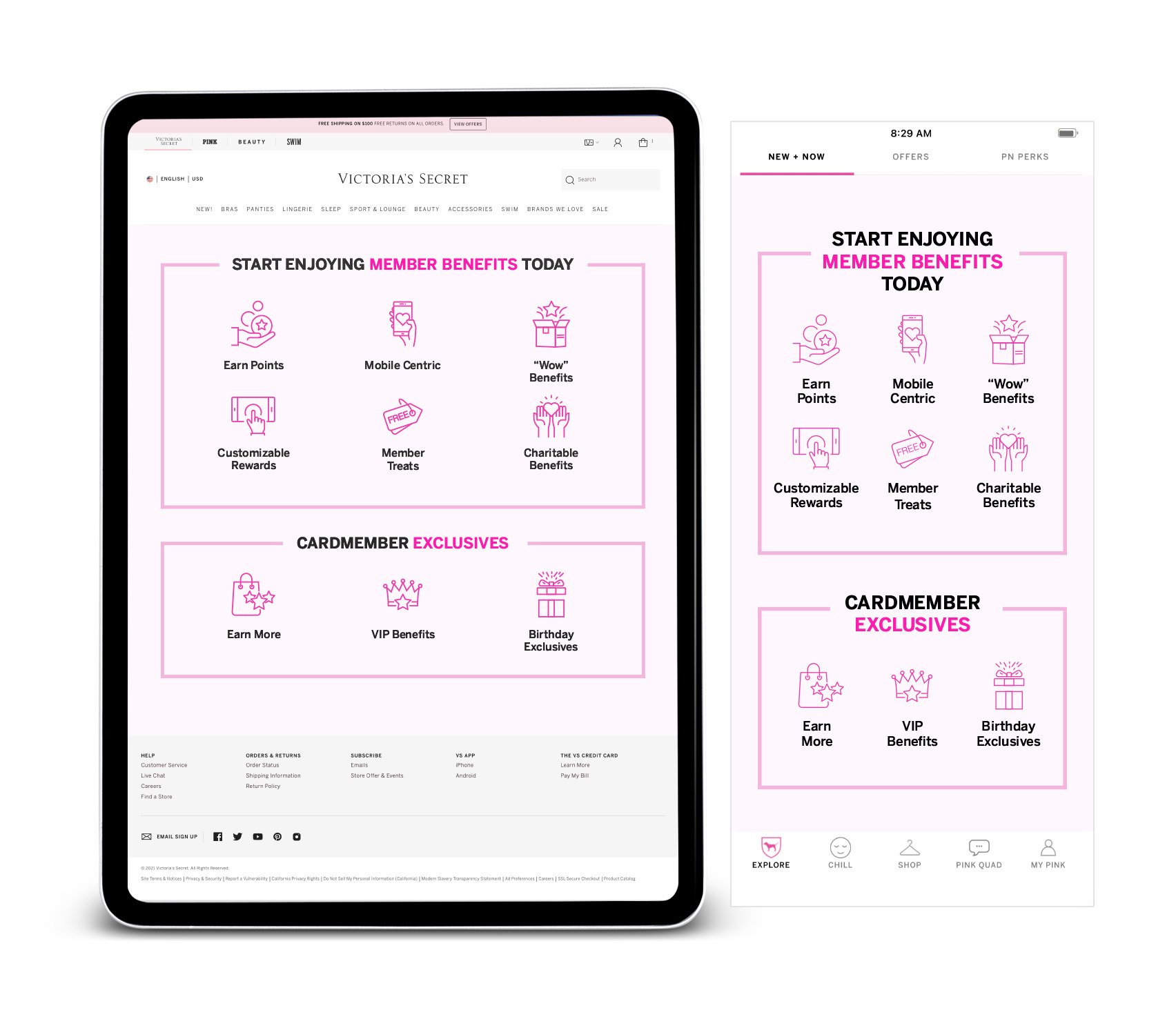
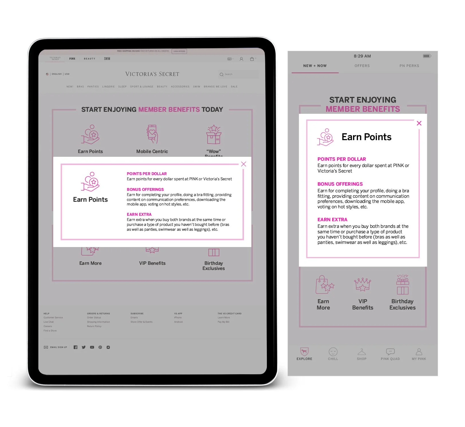
After: Scannable & Engaging
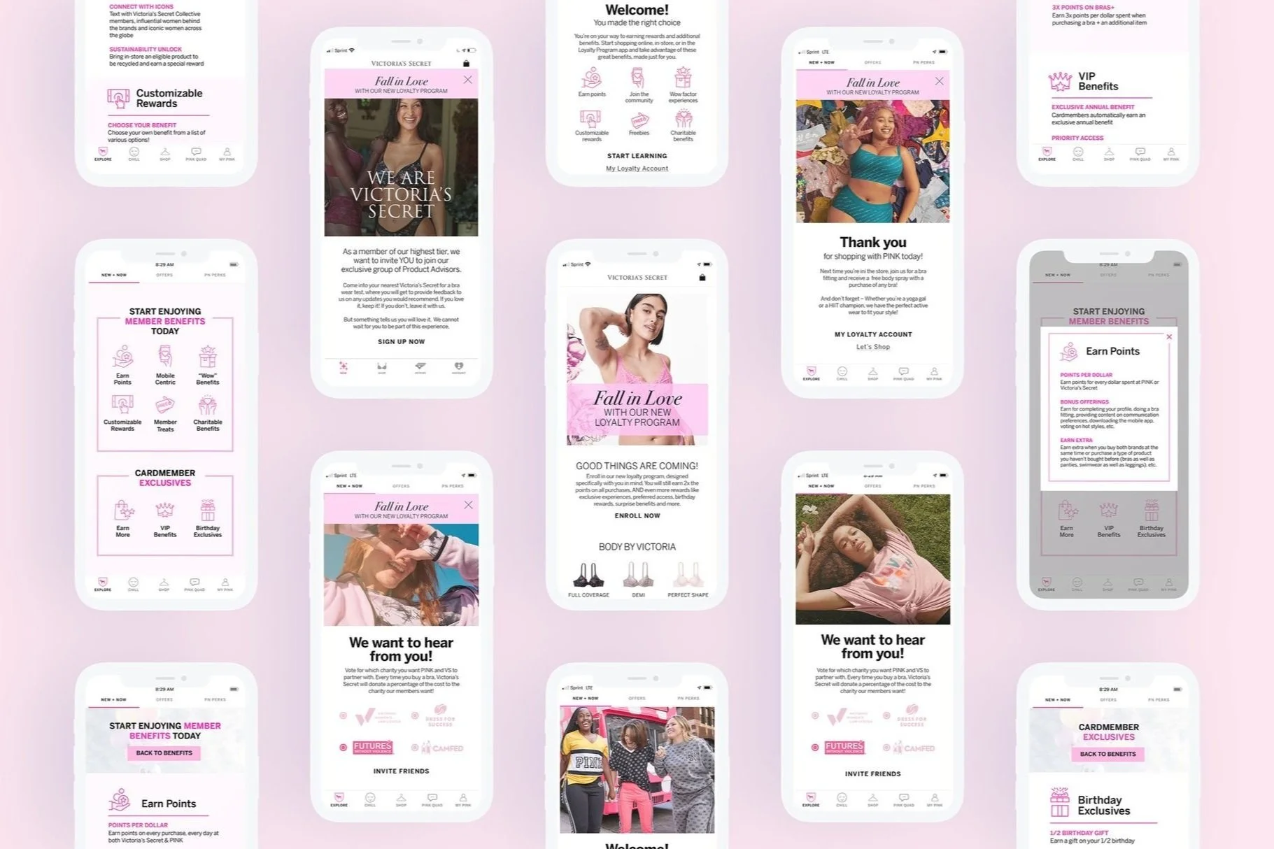
I streamlined the complex product offerings into a vibrant, card-based visual grid. By introducing brand-aligned vector iconography, distinct color hierarchy, and bite-sized content blocks, the redesigned interface transformed static perks into a dynamic, mobile-friendly benefit showcase that enhanced clarity for the user in order to encourage brand engagement.
Strategic approach: Insights and execution
Market Analysis & Insights
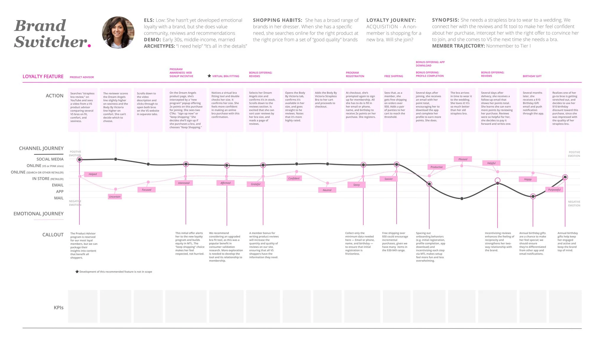
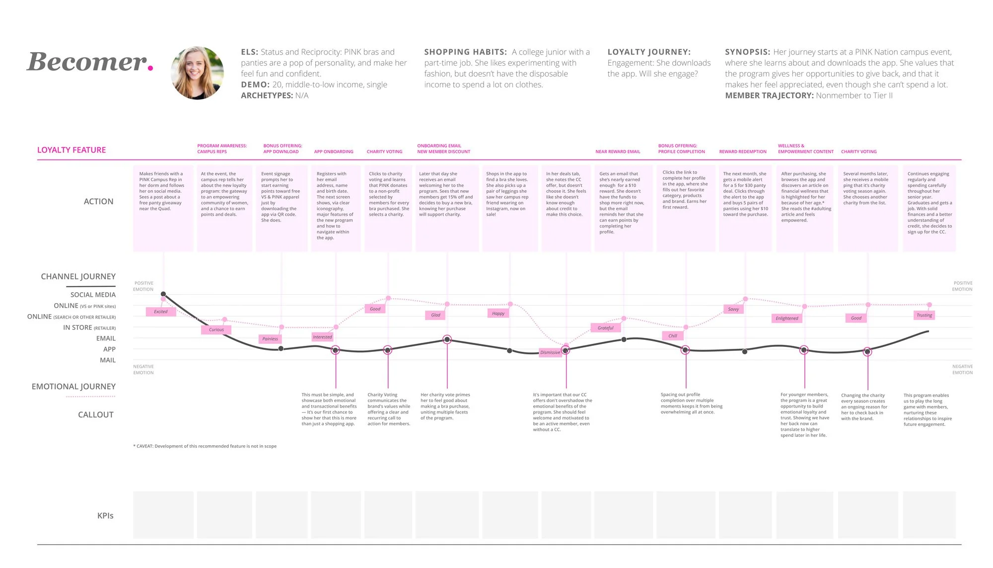
A core objective of the refreshed Victoria’s Secret program was embodying a "minimal and sexy" brand ethos without sacrificing program depth. To ground our design decisions in real customer behavior, we built detailed user personas, mapped end-to-end loyalty journeys, and audited the target audience’s experience. This research revealed critical friction points in benefit discovery and tier progression, highlighting exactly where high-value perks could drive the most impact.
Tailored Design & Go-To-Market Execution
Armed with these insights, we translated complex program structures into an intuitive, visually elevated digital experience. By streamlining multi-tiered benefits into elegant, scannable touch points, we bridged the gap between brand aesthetics and functional UX—creating a go-to-market strategy designed to boost member acquisition, retention, and long-term brand affinity.
Evolving the Shopping Experience
Mobile-First UX & Ecosystem Integration
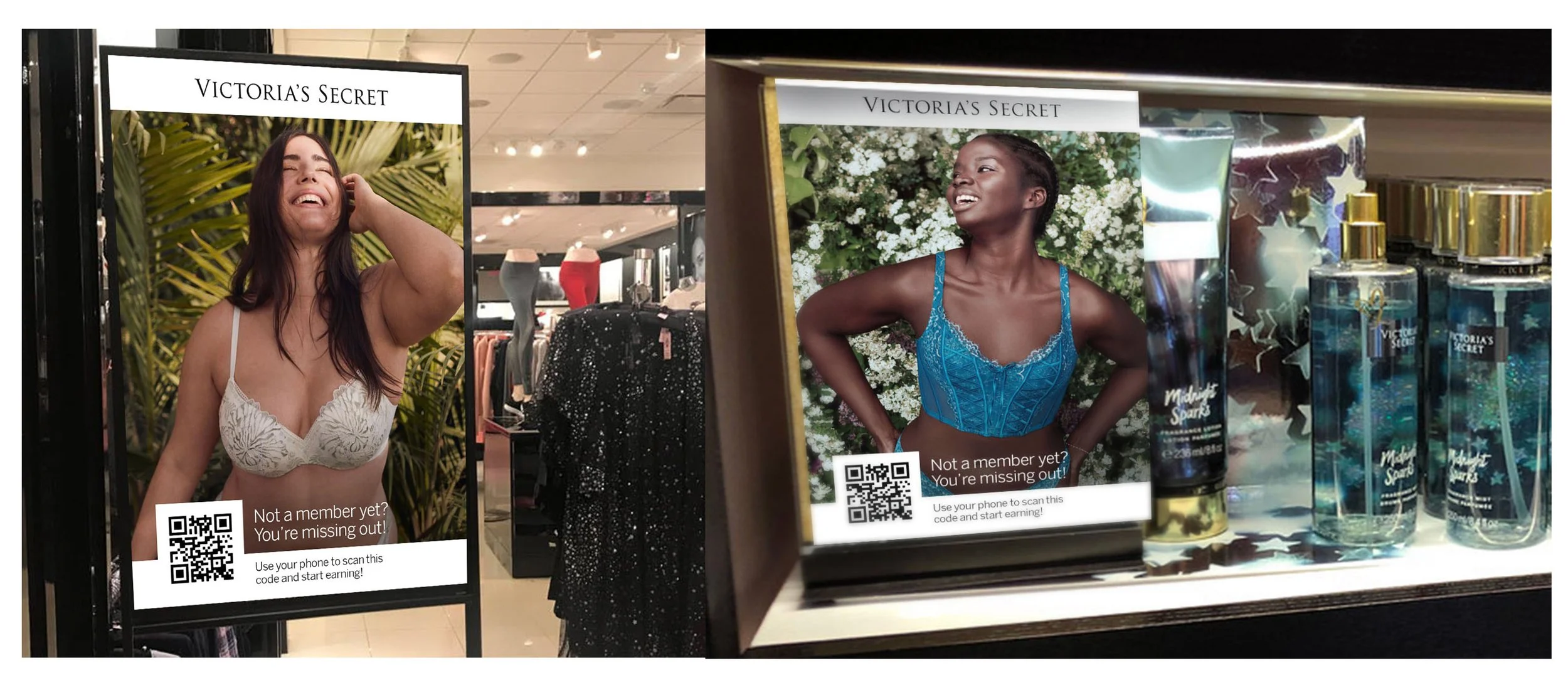
Our primary design focus was transforming how members interact with the brand by bringing rewards seamlessly into their daily routines—wherever and whenever they shop. By placing the user at the center of the experience, we designed an intuitive, mobile-first ecosystem for both Victoria’s Secret and PINK. The result gave members effortless, instant access to their perks, points, and personalized offers directly in the palm of their hand.
Business Impact
The strategic vision, streamlined user journeys, and elevated visual concepts delivered in this proposal directly demonstrated our team's creative and technical capabilities—ultimately securing Victoria’s Secret as a client.
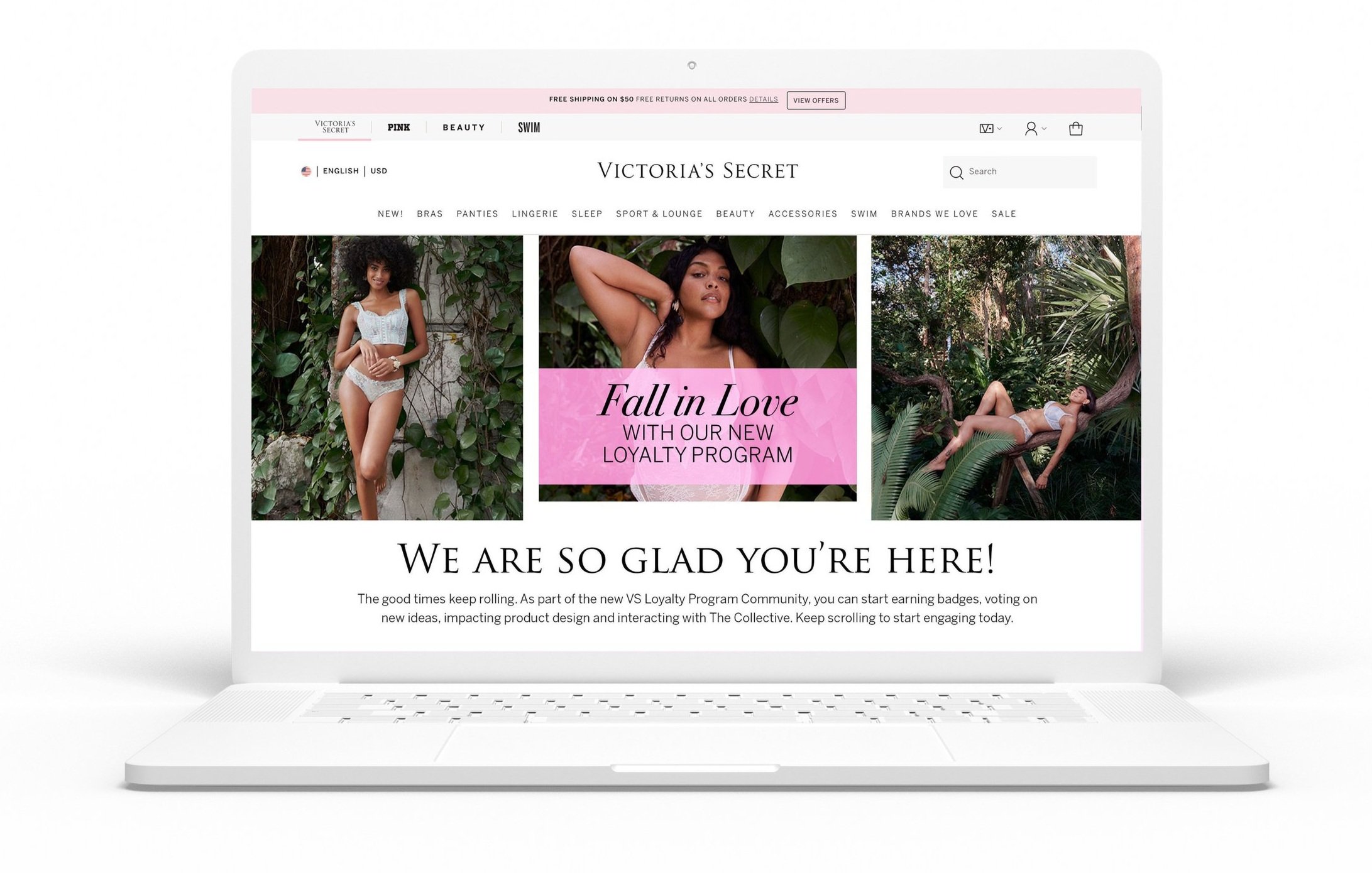
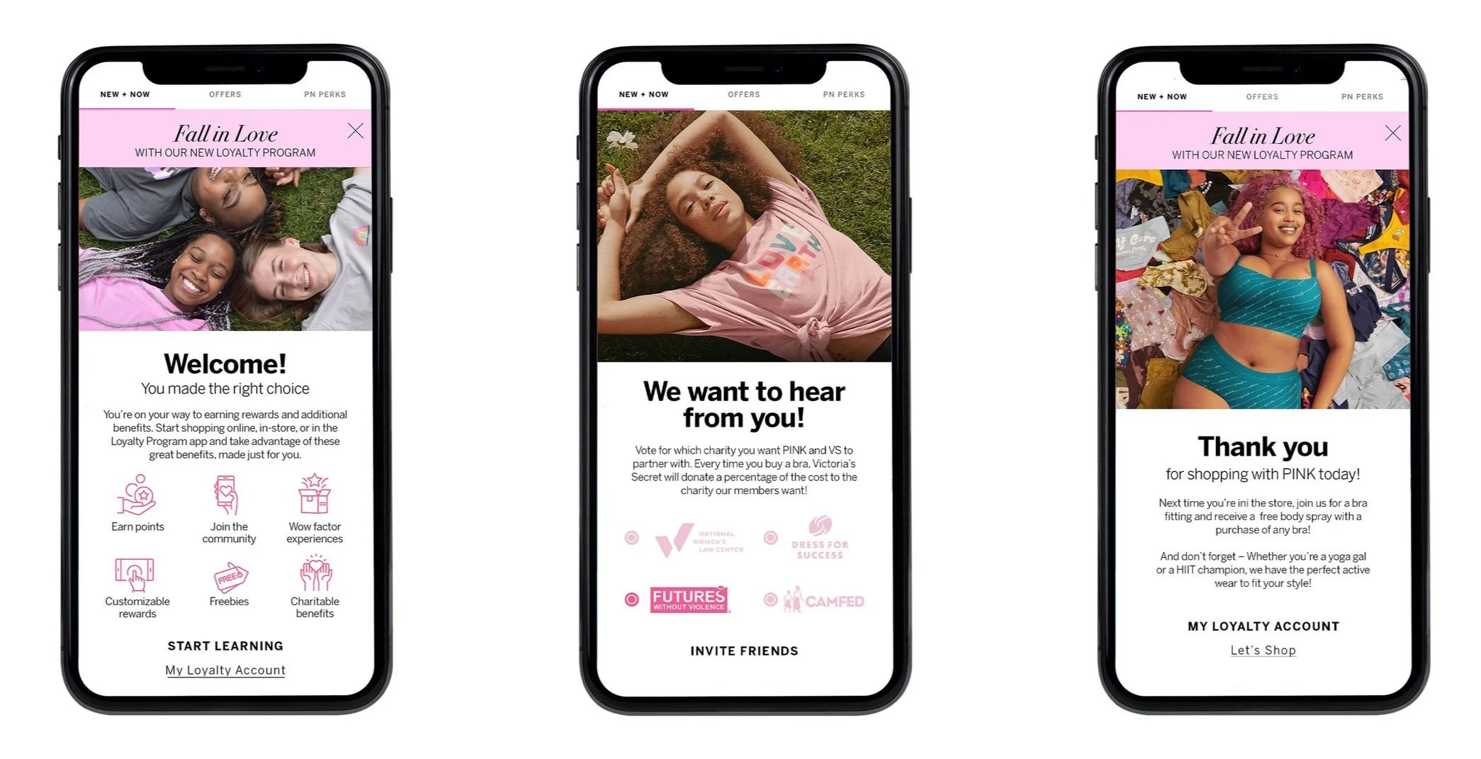
Welcome message screen
Charity message screen
Thank you screen
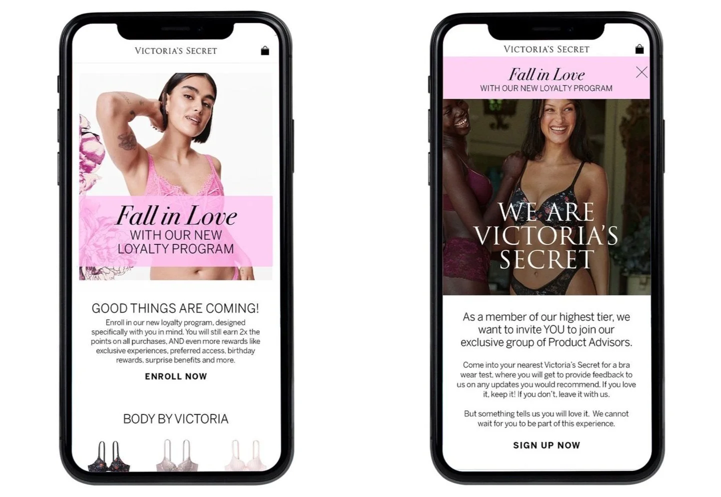
Advisor screen
Enrollment screen