People Identity Exploration
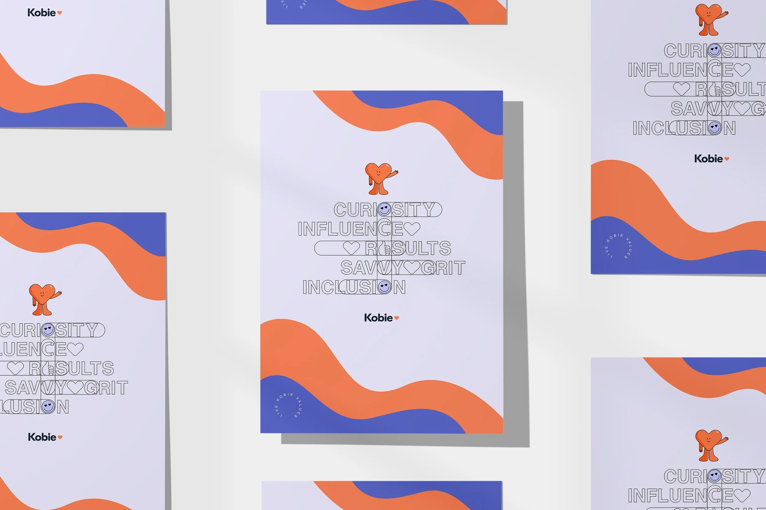
Kobie Marketing underwent a company-wide rebrand to establish a clear distinction between its external B2B marketing presence and its internal brand identity. As the external identity shifted toward a minimalist and sophisticated aesthetic, the internal exploration focused on cultivating a warm, engaging, and people-first visual language tailored for employee communications, workplace culture, and social media touch points.
The Challenge
While the refreshed B2B branding established corporate authority, it felt too reserved for internal culture-building. The objective for internal communications was to create a friendly sub-identity that energized employees, improved the onboarding journey, and felt approachable—without straying from the master brand’s core guidelines.
The Solution
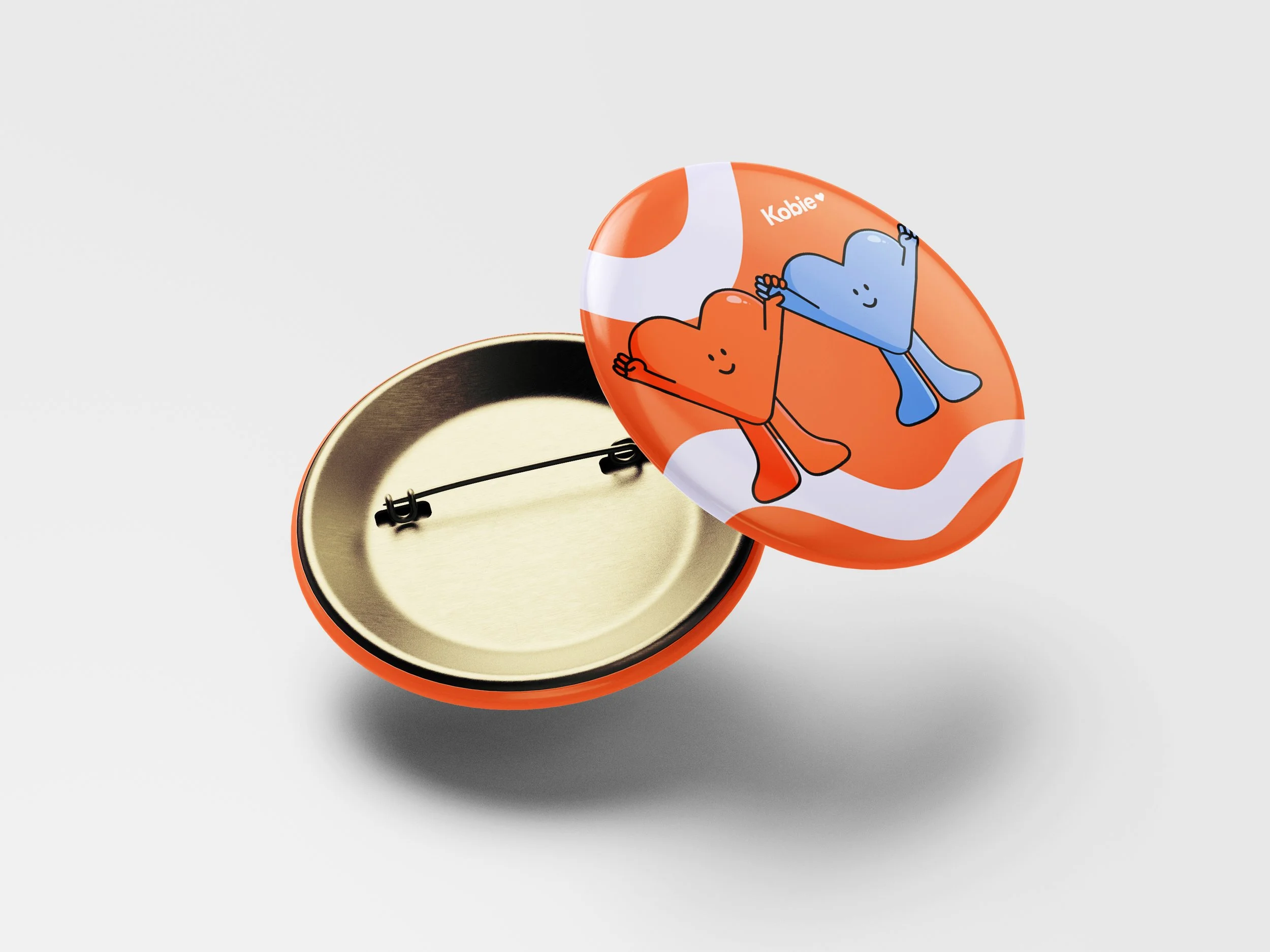
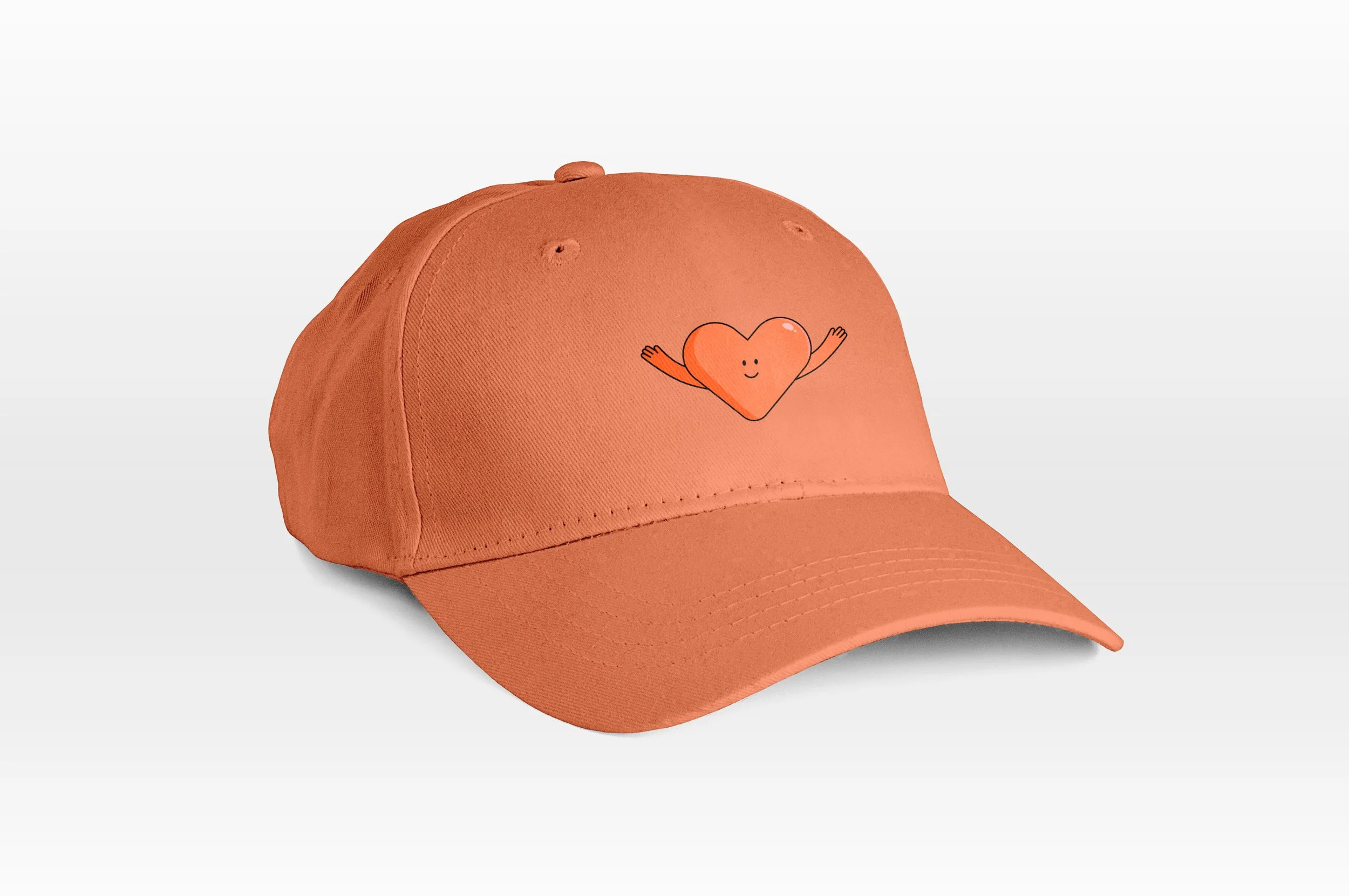
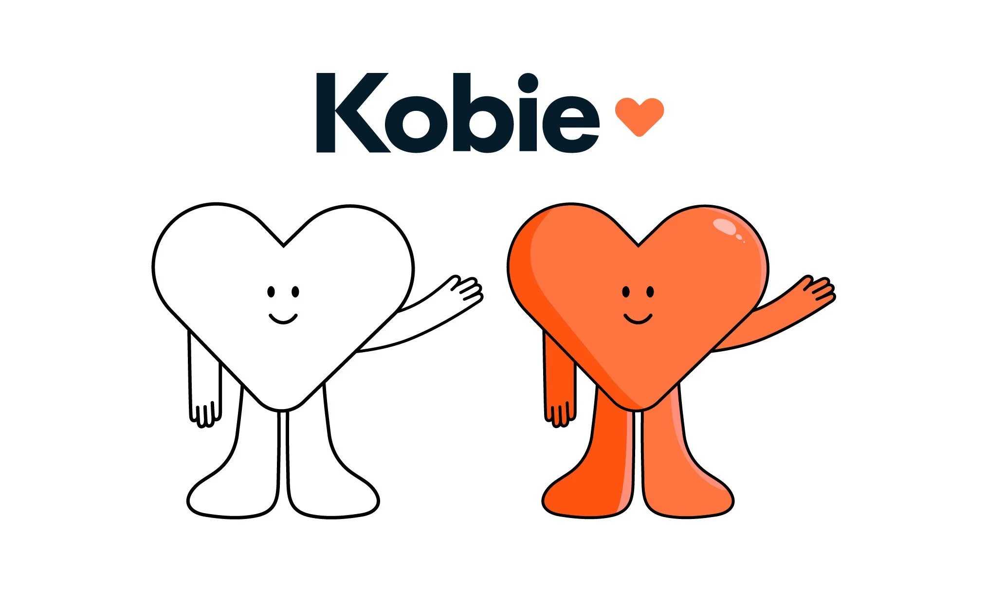
Iconic Sub-Branding: Extracted and elevated the "Kobie heart mark" from the primary logo, transforming it into a standalone signature motif for employee-facing touch points.
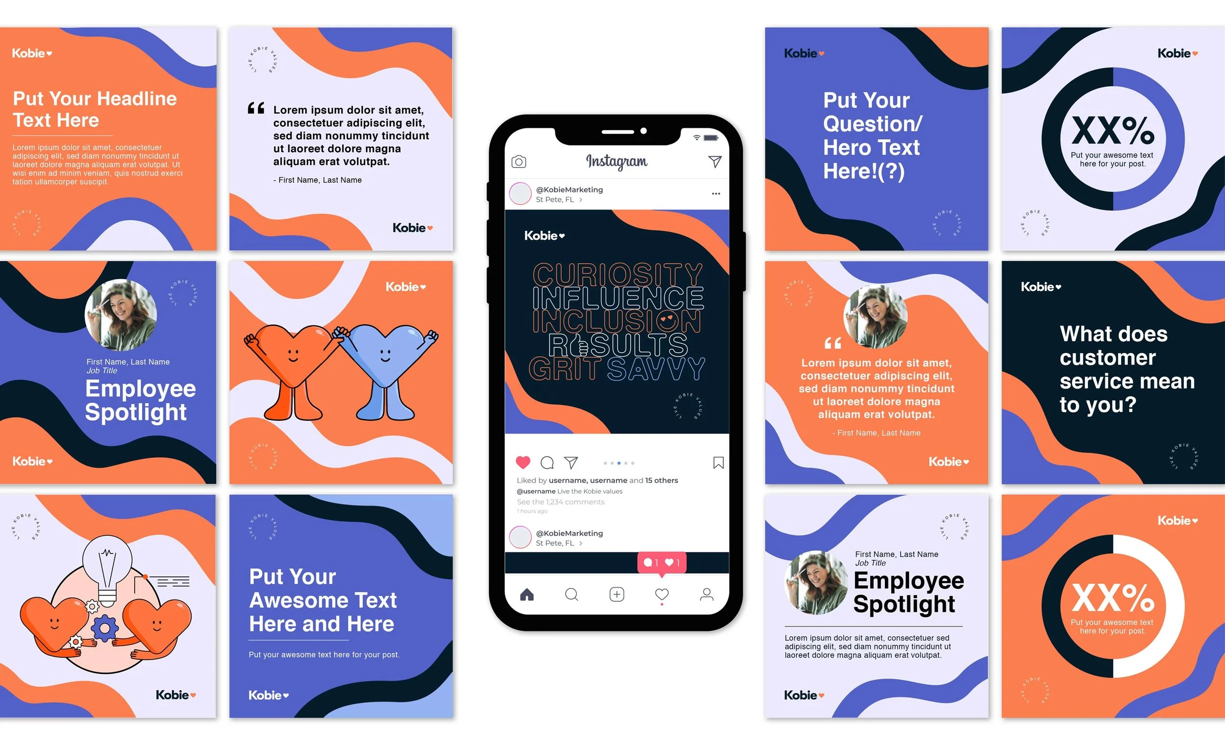
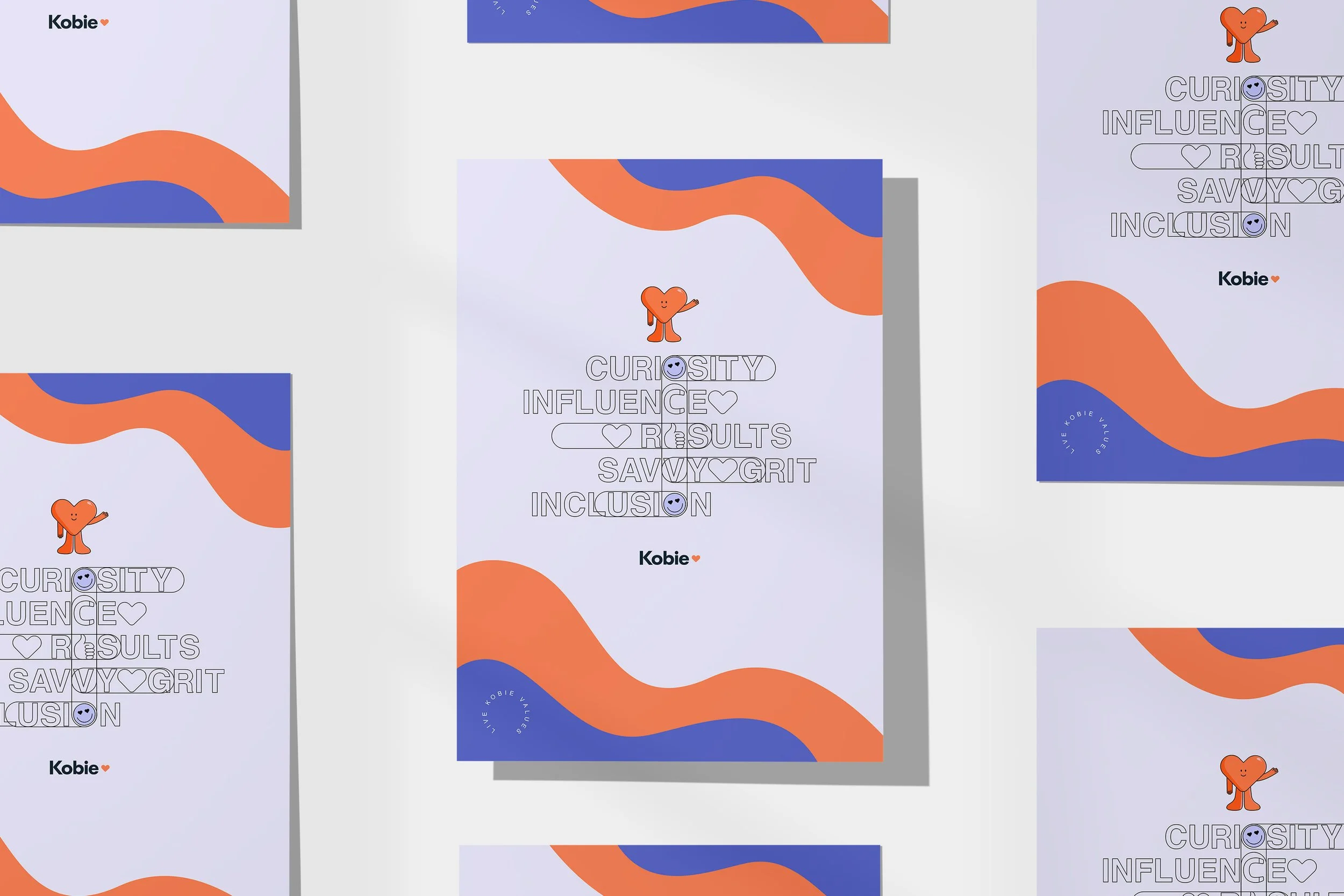
Organic Visual Language: Introduced expressive shapes, fluid graphic elements, and a vibrant color application to bring warmth and energy to internal communications.
Cross-Channel Consistency: Applied the new sub-identity across internal newsletters, cultural announcements, and employer-brand social media graphics—building a cohesive visual home for team culture.

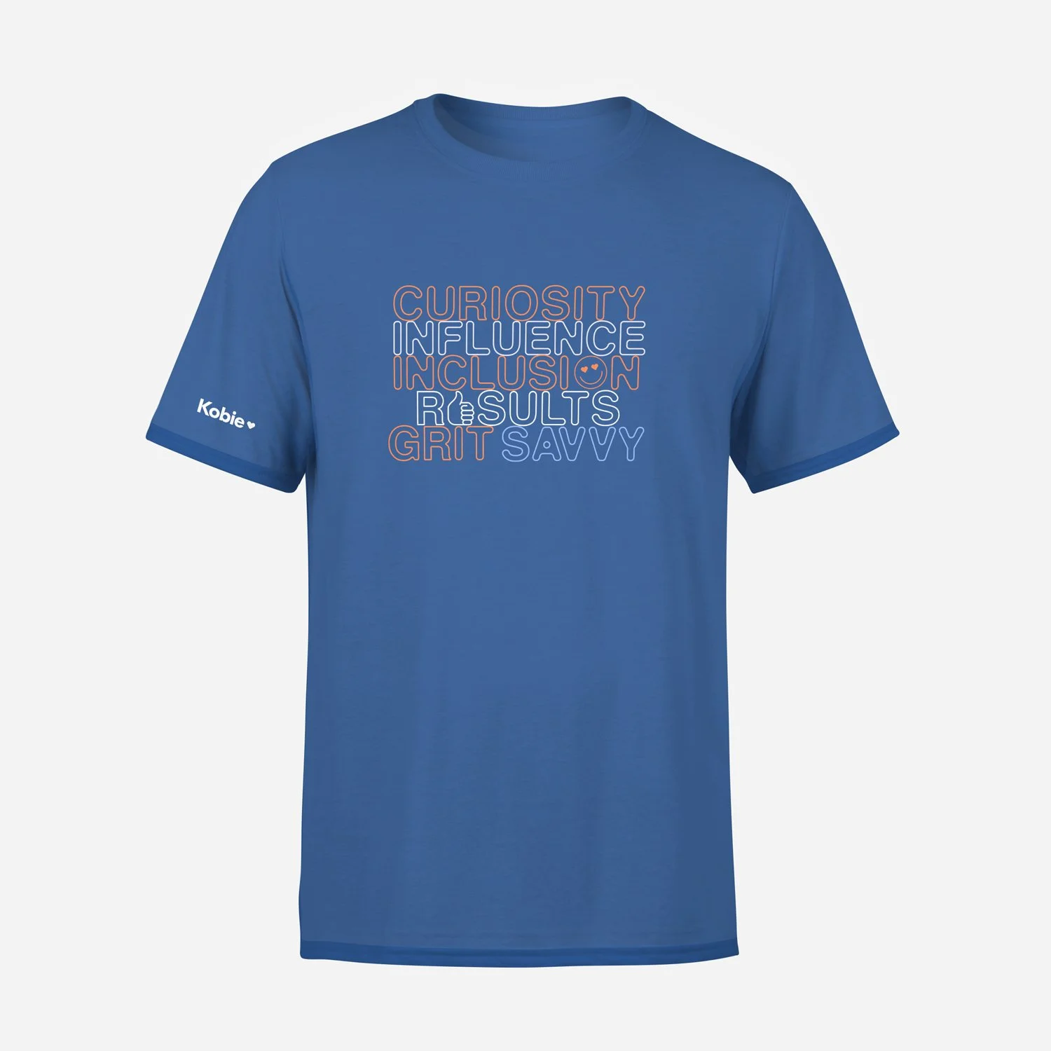
Influence

Saavy

Curiosity

Inclusion
Typography & Brand Voice
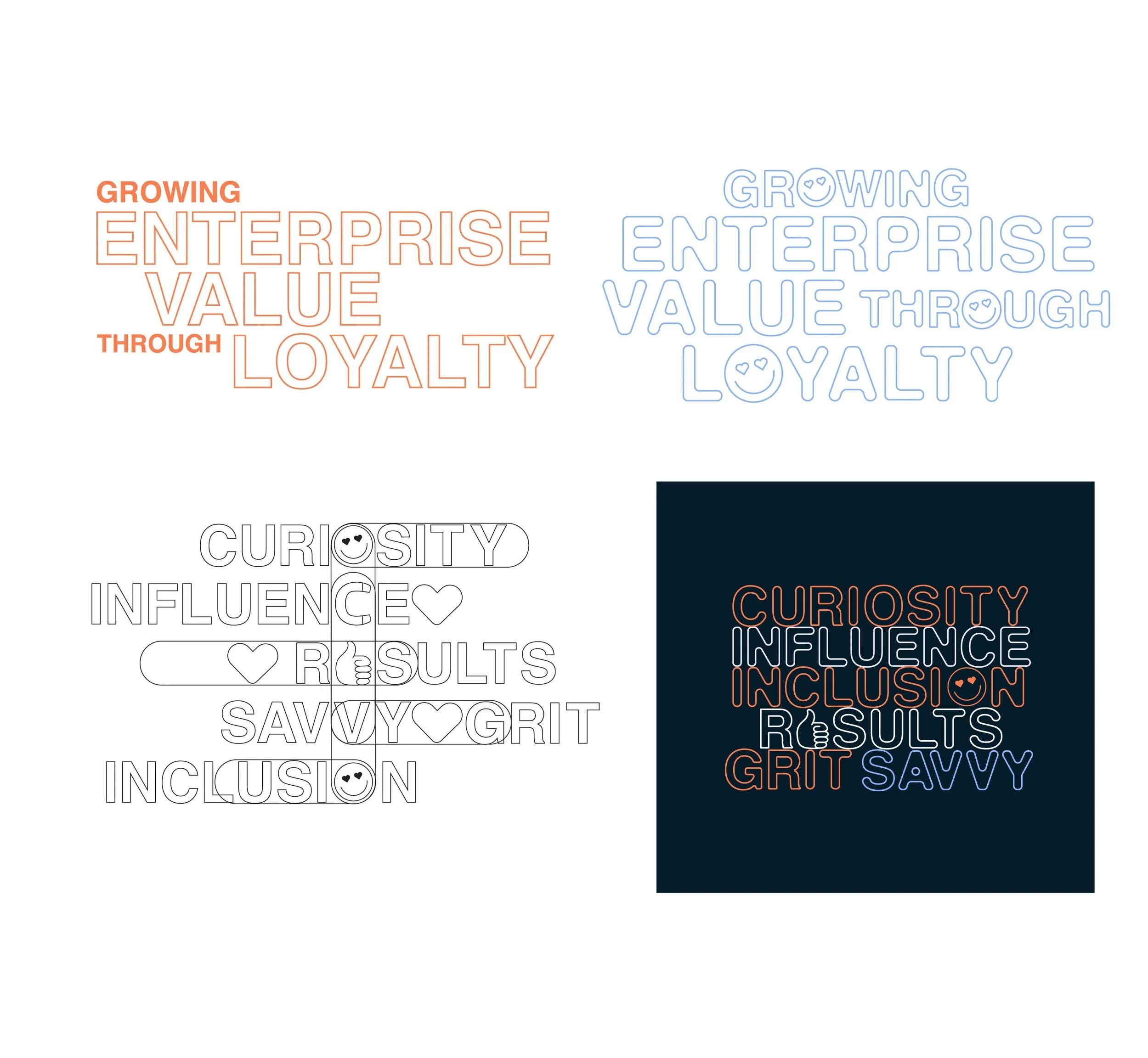
Human-Centric Typographic Exploration
To reinforce Kobie’s friendly, modern internal identity, I developed a distinct typographic system designed to amplify key messaging across company-facing touchpoints.
Design Execution
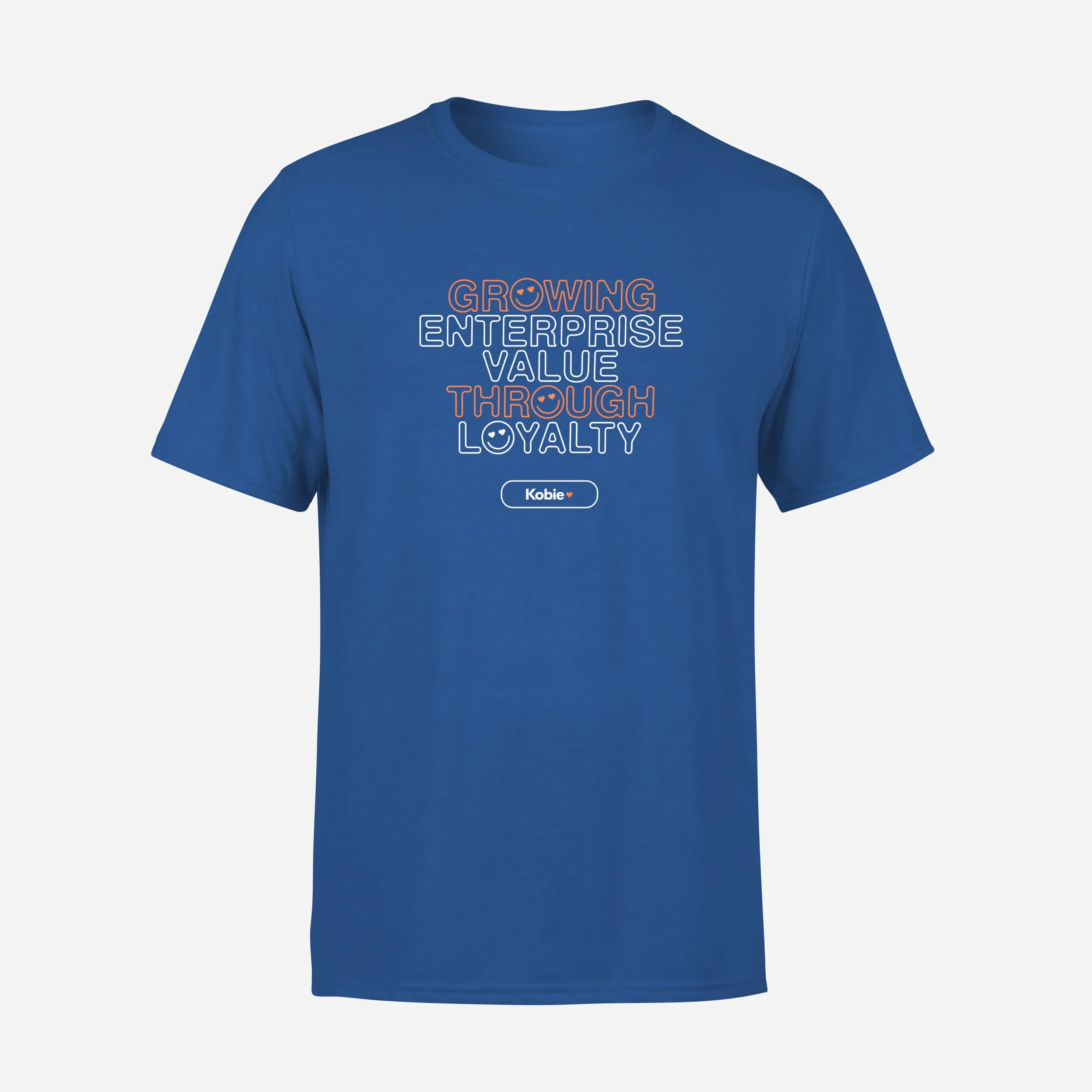
Expressive Display Treatments: Created dynamic headline and callout styles specifically tailored for high-visibility content like company values, core mission statements, and event taglines.
Balanced Tone & Clarity: Paired approachable display typefaces with clean, highly legible body copy to ensure messaging felt warm and engaging while maintaining corporate readability.
Visual Pacing: Used varied weights, scale contrast, and color accents to give internal communications a conversational cadence and draw at